


[ HOME ]
[ Conventions ]
[ Components ]
[ Graphic Tips ]
[ The Disabled ]
[ Help & Support ]
https://members.tripod.com/milleniumkiwi411/webring/epassguide.html
|
Introduction
E-Passes are a great way for modelers to introduce others to their layout, make friends and give visitors' a souvenir of their visit to the layout. Many site and layout owners have spent considerable time and efforts in producing E-Passes that firmly establishes the Net presence of their sites and identities of their modeled railroad.
|
Conventions
The convention between site owners who exchange E-Passes is to feature E-Passes issued by other sites within a collection within their own site which include links back to the issuing sites. With so many beautifully produced passes on the Net, the collection of E-Passes is also becoming a hobby in its own right.
|
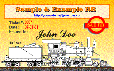
1.This example E-Pass is shown at it's actual size of 400x250 pixels. There is no need to design your E-Pass to fit a full screen. Large files will most probably end up being reduced by the recipient for display on their sites.
2. There are many ways to design an E-Pass, the example above serves to illustrate this article only and is not intended to serve as a design template.
3. There are many sources of train graphics and images that can be found on the Internet. Just be sure not to violate someone else's copyrights. The 2-6-0 locomotive is a copyright free image that can be downloaded from The Railroad Paint Shop.
|
Components of an
E-Pass:
- The name of the model railroad
- The URL for the railroad's web site
- The logo or heraldry of the railroad
- The name of the person to whom the pass is issued
- Each pass should have a unique number
- Each pass should be dated
- Include the scale the layout
- Optional elements could include:
- a graphic that sets the mood or illustrates the type of layout
- the name of the site owner
- a slogan
- an appropriate "blurb"
- anything else that you feel is appropriate
|
|
Graphic Tips
There is no standard size for E-Passes, but it will help immensely when designing or improving your design to know a little about graphics on the Web. As far as computers are concerned, an E-Pass is just an image file. Image files invariably tend to be large data components and large data files on the Web means slow page load time.
Why would anyone be concerned about page load time? To answer this question just ask yourself this question: "How long would I wait for a page to load?" At least one reliable survey indicates that the average surfer is willing to wait for about 10 seconds! What this means to layout site owners is that all the effort that they have invested into collecting and displaying their E-Passes will come to naught if most surfers are unwilling to hang around long enough for the entire page to load. So what can be done?
First off, try not to include more than four large image files on any single web page. Instead, use sequential pages to display your entire collection of railroad E-Passes. Alternatively, you can use much smaller thumbnails, each of which is linked to its larger original that resides on their own page. Secondly, understand how to design graphics for the web so that when you prepare your own E-Pass or receive E-Passes from other sites you will know how to optimize them for use on the Web.
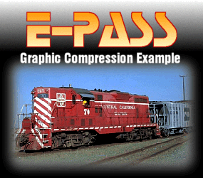
Take a look at the 3 images of the K-2a below, all the images are 170 by 170 pixels. Can you tell the difference?
|
|

Image 1 |
Image 2 |

Image 3 |
The difference will be most apparent on a monitor set to display 256 colors at a screen resolution of 640x480 pixels. On other settings and monitors, image 3 just begins to show some signs of blurring, a result of the compression process. The image is still clear enough for illustrative purposes and on its own along side a text blurb, few readers would have paid much attention to the blurring. Model railroaders on the other hand like to look hard at pictures of trains, here is where digital enhancement can come in handy. Image 1 has been digitally enhanced. The original photograph was not much clearer than image 3. For comparison, here are the stats for the 3 files:
- Image 1: 170x170 pixels / 75 ppi / JPG / 1:1 compression ratio / 23KB disk / 28KB memory
- Image 2: 170x170 pixels / 75 ppi / GIF / 1:1 compression ratio / 18KB disk / 28KB memory
- Image 3: 170x170 pixels / 75 ppi / JPG / 1:1 compression ratio / 5KB disk / 28KB memory
There are primarily two file formats for image files on the Web. The GIF and JPG formats. Each format uses an algorithm to compress the data to make the image files more compact. There is a common misconception that GIF files are just for drawings and JPG files are for photographs. The section below details the differences.
Compuserve Bitmap GIF Format
The GIF format is usually associated with line art and text graphics. This is generally because the format is superb for compressing images with large solid bodies of color or sharp edges. One of the major draw backs of the GIF format is that you are restricted to 256 colors. To accommodate more colors, the system uses "dithering" (mixing colors). If you look carefully at the graduated background on the example E-Pass you can see the exact effect, especially towards the top. The example E-Pass measures 400x250 pixels and weighs in at 33KB. An equivalent file in JPG format would have weighed in at a hefty 176KB and the only difference discernible would be that the background would have been smoother. The graphic was developed on a vector based application.
If your E-Pass uses primarily line art and large bodies of solid color, use the GIF format for your E-Pass file. If you have any doubts at all about the format's ability to handle softer, more gradual color graduation, look again at the title graphic on this site which is also a GIF image.
JPEG File Interchange JPG Format
This format was developed specifically to handle more complex images such as photographs. This format can handle 32-bit color files and is much more proficient at handling subtle tones such as occurs with fine art prints and portraits of people. Strangely though, when handling images with sharp edges such as trains, it does not necessarily fare better than the GIF format.
If your E-Pass was produced in an application that primarily handles pixels, or includes fine imagery, usually this format is best.
As a final illustration have a look at two identical images saved alternatively as a JPG (left) and as a GIF (right) file. The image of the train was digitally enhanced to make the colors stronger and to sharpen the focus. Can you tell the difference (even on a low resolution monitor)?
|
- Image 1: 285x250 pixels/ 75 ppi / JPG / 1:1 compression ratio / 58KB disk / 209KB memory
- Image 2: 285x250 pixels / 75 ppi / GIF / 1:1 compression ratio / 43KB disk / 70KB memory
|
Surprised? Reload this page and see how much faster the GIF image loads. This serves to illustrate that it is very hard at times to tell the difference in image quality between GIF and JPG files. In practice you will need need to experiment to see what works best for your particular E-Pass image.
|
Design Considerations for the Disabled
Recently the US Congress passed an Amendment to the Americans with Disabilities Act that stipulated that all business that wished to receive government contracts that have web sites, must make their sites assessible to the disabled. This has had many businesses, even those who do no business with the government (who fear law suits being filed against them), scrambling to make their sites compliant with the new Law.
For professional web page designers, this is proving to be a major headache as many techniques currently employed to create and structure commercial web sites do not work well with text-only and speech-enabled browsers that many of the disabled need to use. This page for example will not be fully compliant with the new Law as it relies entirely on tables to constrain and layout the page contents. One of the biggest culprit will be something that you cannot see and this is the 1x1 pixel transparent GIF that has been used liberally throughout this site to do amongst other things, indent the paragraphs. On a speech enabled browser, this invisible graphic will cause havoc.
So what has all of this to do with E-Passes? Especially since, as a private individual, there is no provision under the new Law that directly affects anything you are doing on your site. It is this: there are many disabled people who are also interested in, or who are active model railroaders. If they are restricted by circumstances to having to use a text-only or speech-enabled browser, they will never see any of the beautiful E-Passes featured on railroad sites around the Web.
I do not pretend that I have any real solution to this probem, but here is a suggestion that may help alleviate the problem. That is to make full use of the <alt> tag. Whenever you code an image to load on a web page, you have the option of adding a description of the image using the <alt> tag, and you can see this done on this page with every image including the animated train at the top of the page. Text-only and speech-enabled browsers can "see" these tags. As an experiment, turn off the "show pictures" option on your browser and you will get an idea as to how this page will look on a text-only browser.
The <alt> tag will take about 255 characters, more than enough to write a brief description of the E-Pass (or other image) featured on your web page. I have done this for the example E-Pass. If you let your mouse hover over the image you should see the <alt> description in the pop up box; with pictures disabled the text will be in the frame where the picture would have gone.
You will have noticed that this method does not work for the graphic navigation bar (which is image mapped). To allow for this, this page also includes traditional text links. This is especially important, as some disabled persons may not be able to use a mouse and needs to navigate with the keyboard. If you use buttons as navigational links on your site, take this factor into consideration also.
|
Help and Support
If you have any questions or comments about any of the contents on this page please feel free to E-Mail me. If you wish to expand on any of the articles on this page, please also feel free to contact me.
Sorry, but the example E-Pass is not available for issue, but you do have my permission to download it for your own personal reference. If you would like to get an E-Pass from the Penny Lane Central you can do so by visiting it's main site.
Useful Links
|
[ Back to Top ]
Copyright © Sean Lim July, 2001
All Rights Reserved
Last Revision: 07-04-2001
|